I loved how so many of you spied just one little corner of my thrift store buffet without me even mentioning it in last week’s kitchen cabinet post. You clambered to see more.
![[kitchen%2520105%255B4%255D.jpg]](https://blogger.googleusercontent.com/img/b/R29vZ2xl/AVvXsEiteLlugnxGjF3Uzc3PuiVsfT48hyphenhyphencu3vk6ucXVMKPedg33rNrbBbrY-4Nk2R8cZWAiI4cw54Wsil7-pT_z4kfgZO8mN6gVLSguJoJVXBm59HGNuUqICIhvgaLvuC-sY-oQ09zeEPHYdViM/s1600/kitchen%252520105%25255B4%25255D.jpg)
But of course, as with all my decorating, there is a story.
I shared with you recently that I had plans to paint this buffet/server. A few wood lovers were against it, but given that my kitchen is so dark and the piece needed some love I continued on my colorful quest.

I currently have orange toned cabinets which I have not been shy about saying that they are not my favorite. Yes, I know. Paint them. Creamy white. Mr. Décor is not on board. Yet. But it’s on my list. A “to do” list that probably hovers in the 200 + project range. You too?
Ok. So, I am currently living with orange toned cabinets. Do you know how to work with a color you don’t like? You detract from the color by pairing it with a complementary color. A complementary color is the color found on the opposite side of the color wheel. So in the case of yellow orange it is blue violet. Red orange is paired with turquoise.

So turquoise and blue violet it is. Are you scared? Trust me.
While the brilliant Provençal colors such as the intense ochers, magnificent Mediterranean blues and lovely lavenders would have worked beautifully together, I was seeking something softer. A mere whisper of color.

It was actually the time worn shades created by decades of sunshine I wanted to see on the buffet.
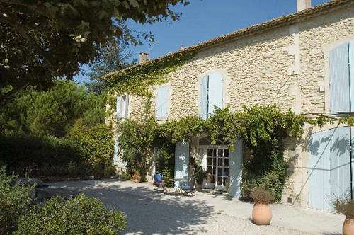
Once vibrant greens now faded to a pale mint.

Perhaps with just a touch of blue added in.

I could see the combination of the two colors paired together in my mind. It was…altogether lovely.
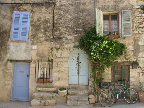
But not everyone has the ability to put on such rose colored glasses. Cough snort, Mr. Décor, cough ahem. They need a visual example.
So for him, and maybe for you….
Can you see the two colors paired together now?
I had decided that I was finally going to try Annie Sloan chalk paints. The beauty of this particular paint is that the surface needs no preparation. I however did a light sanding to smooth out some rough edges. This took place on my backyard patio before the early morning Phoenix heat sat in.

It was just enough sanding that the buffet/server appeared to need a good dusting.

The nooks and crannies required hand sanding.

Everything was wiped off with a damp cloth followed by a dry cloth. I then walked away and did other things the rest of the day. In the evening Mr. Décor helped me bring the heavy piece back into the kitchen as it is currently too hot to paint outside.
We laid down a drop cloth and propped the piece up on bricks. It was then time for bed.
The next morning I applied a bright first coat of Louis Blue and Provence and once again walked away.

Later that same afternoon I studied the piece and wondered how detailed I would get in painting the piece two separate colors. The door was a perfect place to experiment. It was determined that simple was better.

I also decided that I wanted more of a lighter purple based blue with a touch of grey for the overall base color. WHAT? So I combined equal amounts (4 ounce containers) of Greek Blue, Paris Grey, Louis Blue and Pure White. For the secondary color I combined equal amounts of Provence and Pure White. I am thankful that because of the several color classes I have taken I could create what I saw in my minds eye. The color resulted in what I call faded Provençal glory.

The inspiration shot once again…pretty good match yes?
This was my first time using ASCP. I tried a variety of ways to apply the paint. The natural hair brushes that were recommended resulted in very visible brush strokes which I did not like at all. But that is just me. Next, I tried my beloved Purdy brushes. No go. I finally settled on a foam roller for the flat surfaces and a foam brush for all other areas. But keep in mind that this paint will never dry to a completely smooth finish. Believe me I tried.

Given that this piece was going to be used front and center in a hard working kitchen I opted to apply three separate coats of paint. It dried very quickly but I took my time since it is when I get tired that things can get sloppy. The result was that my kitchen was tore up for days, which made meal prep for houseguests interesting. But everyone enjoyed seeing the progress made and liked interjecting their opinions, which I loved.

I decided one morning that I was happy with the painted finish and applied one coat of clear wax. You can see the side by side difference of the finish in this image.

It created a nice durable surface.

Going against convention I opted not to distress the piece. GASP! Is this even legal when using ASCP? My thought is that it will naturally distress over time.
But still I wanted this circa 1970 piece to look more like it was from 1870. So I applied two coats of Minwax dark paste wax. Channeling my inner Daniel I then hand buffed the buffet using an old t shirt of Mr. Décor’s.
Now we’re talking.

All told I invested approximately 8 hours into this piece over the course of four days. But I was continually cheered on and now it is appreciated by everyone in the family.

Come back on Friday for the reveal. I know, I know, SO MEAN!
Do you think I kept the same hardware?
Laura
© 2012 Decor To Adore Laura Ingalls Gunn All Rights Reserved
Hiç yorum yok:
Yorum Gönder